Corbeil Appliances
A refreshed flyer system designed to bring clarity, consistency, and stronger visual impact across every page.
Flyer Refresh
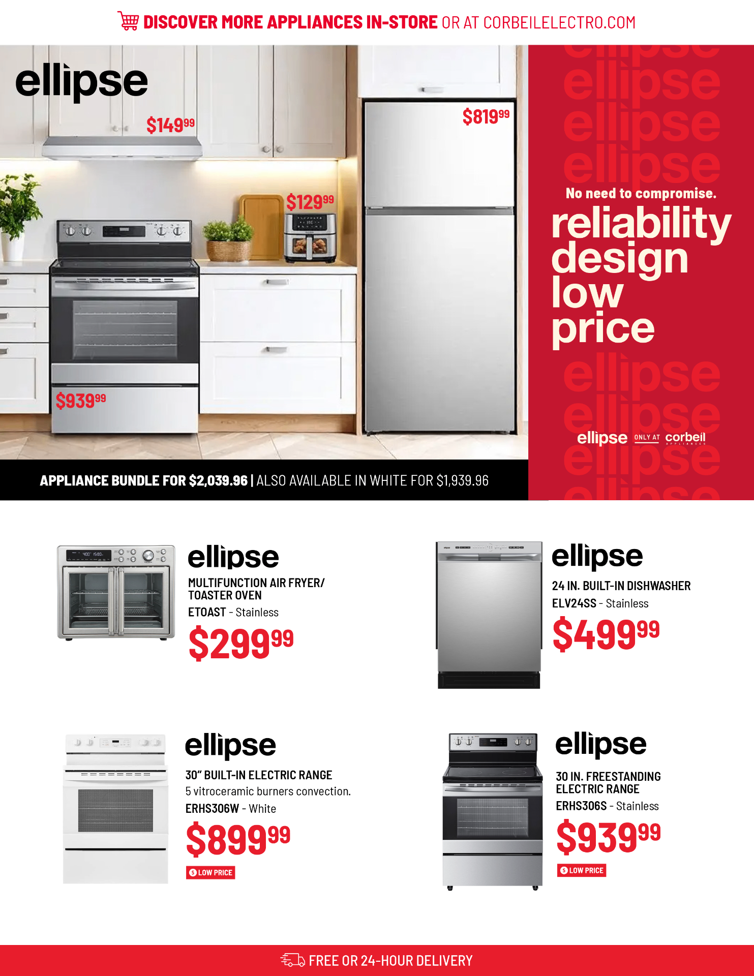
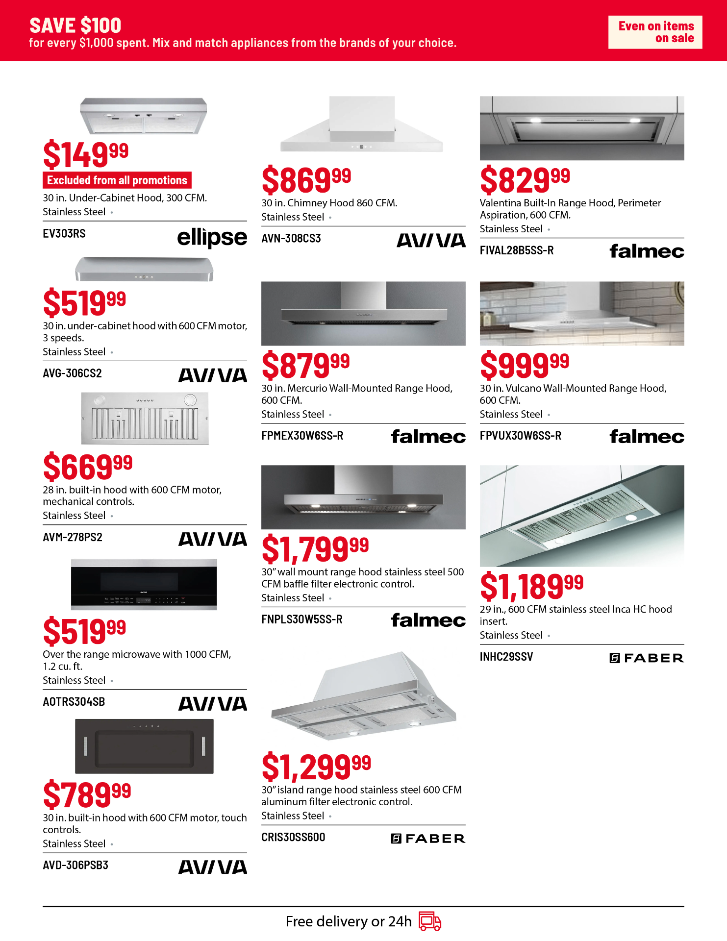
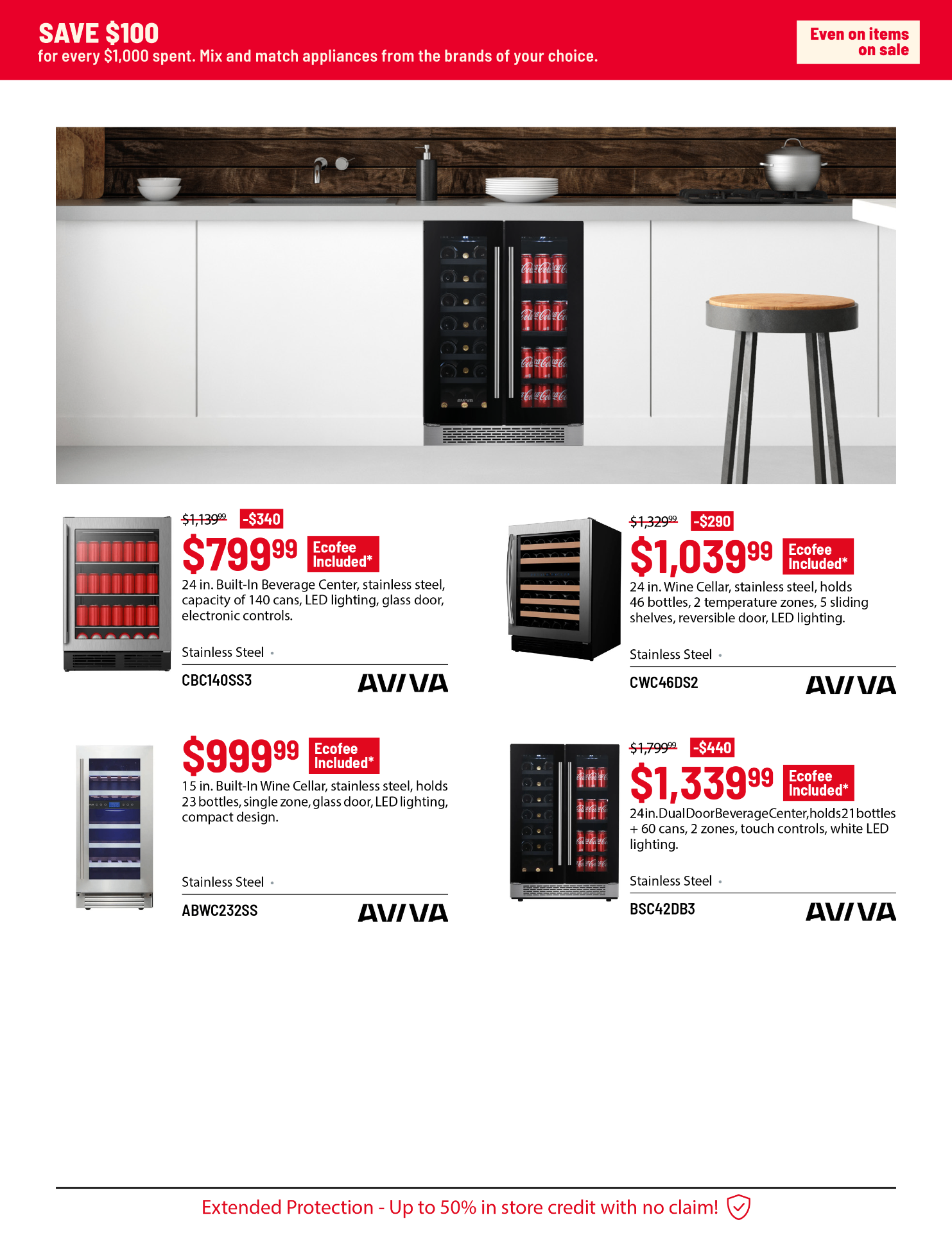
The original flyer relied on dense layouts and inconsistent hierarchy, making it difficult for key promotions and product details to stand out within a high-volume retail format.
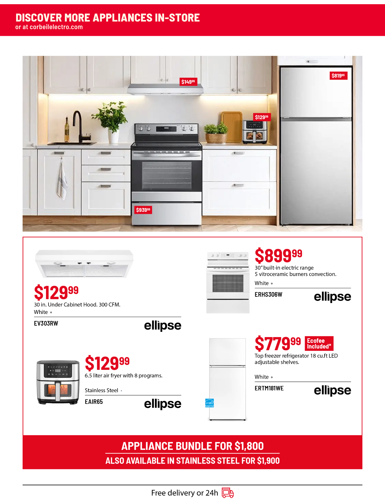
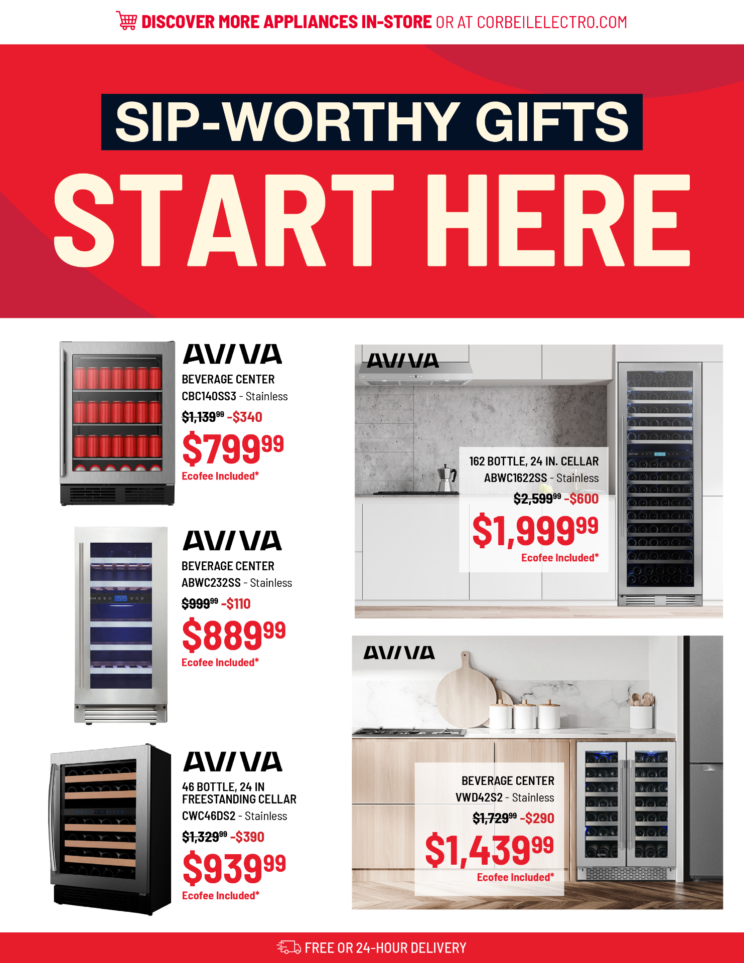
The redesign introduces a more structured and intentional system, where typography, spacing, and layout work together to guide the viewer through each page. Clear entry points were created for promotional messaging, while product groupings were refined to improve scanability and flow.
A simplified visual language, combined with more consistent alignment and spacing, allows the content to breathe while maintaining the volume required for a promotional flyer. The result is a more cohesive and accessible design that enhances clarity, strengthens brand presence, and improves the overall browsing experience.
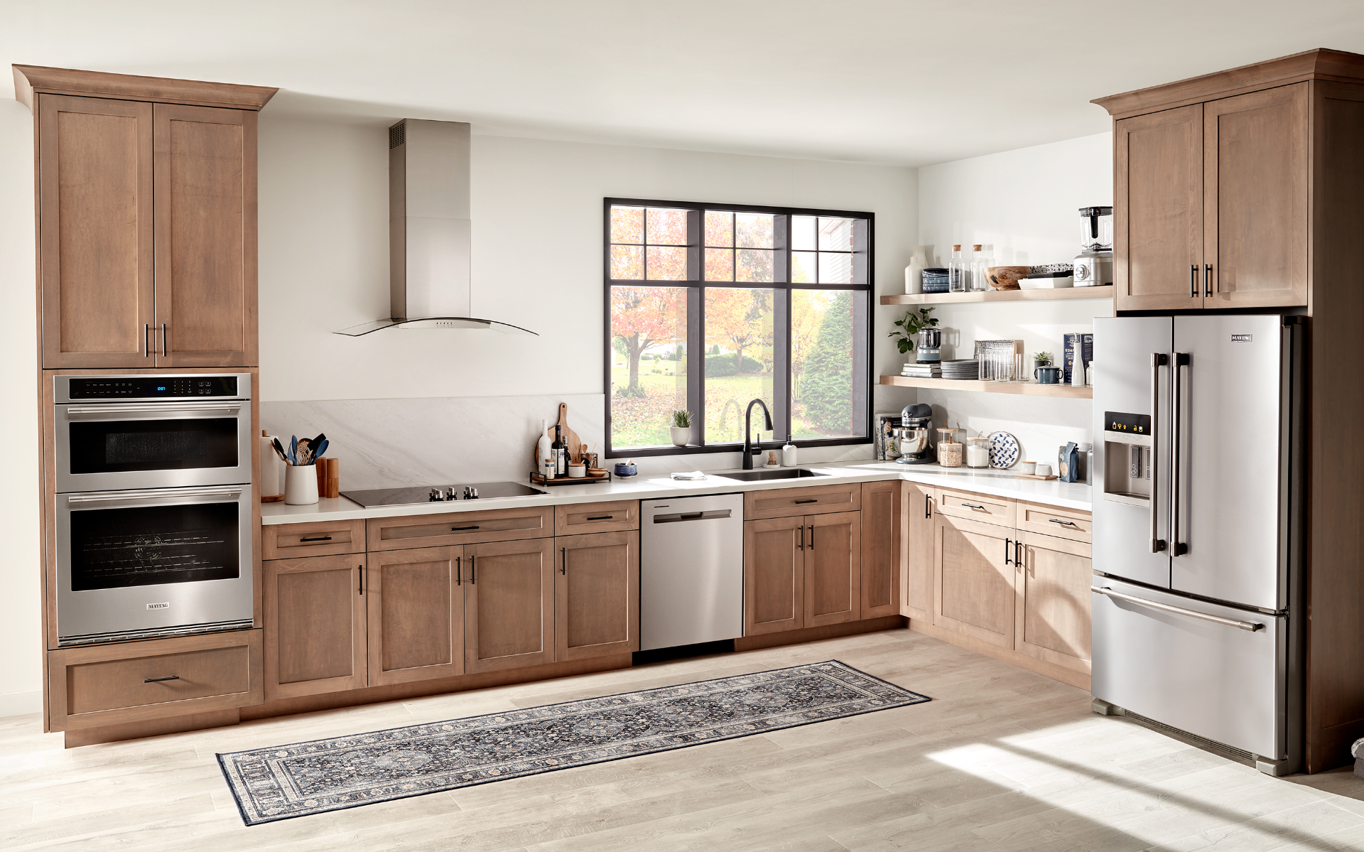
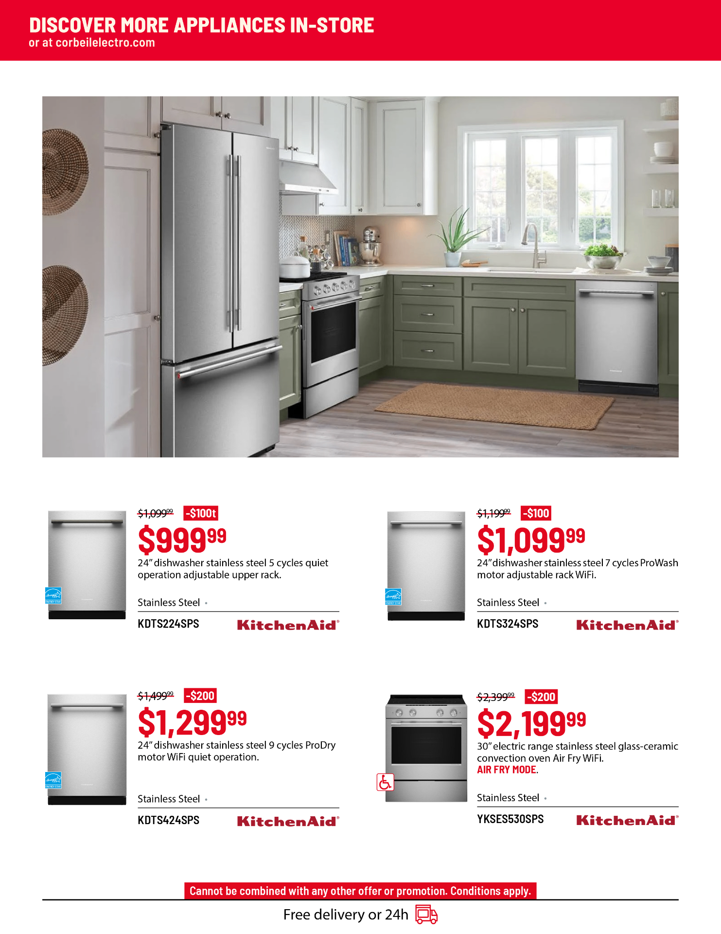
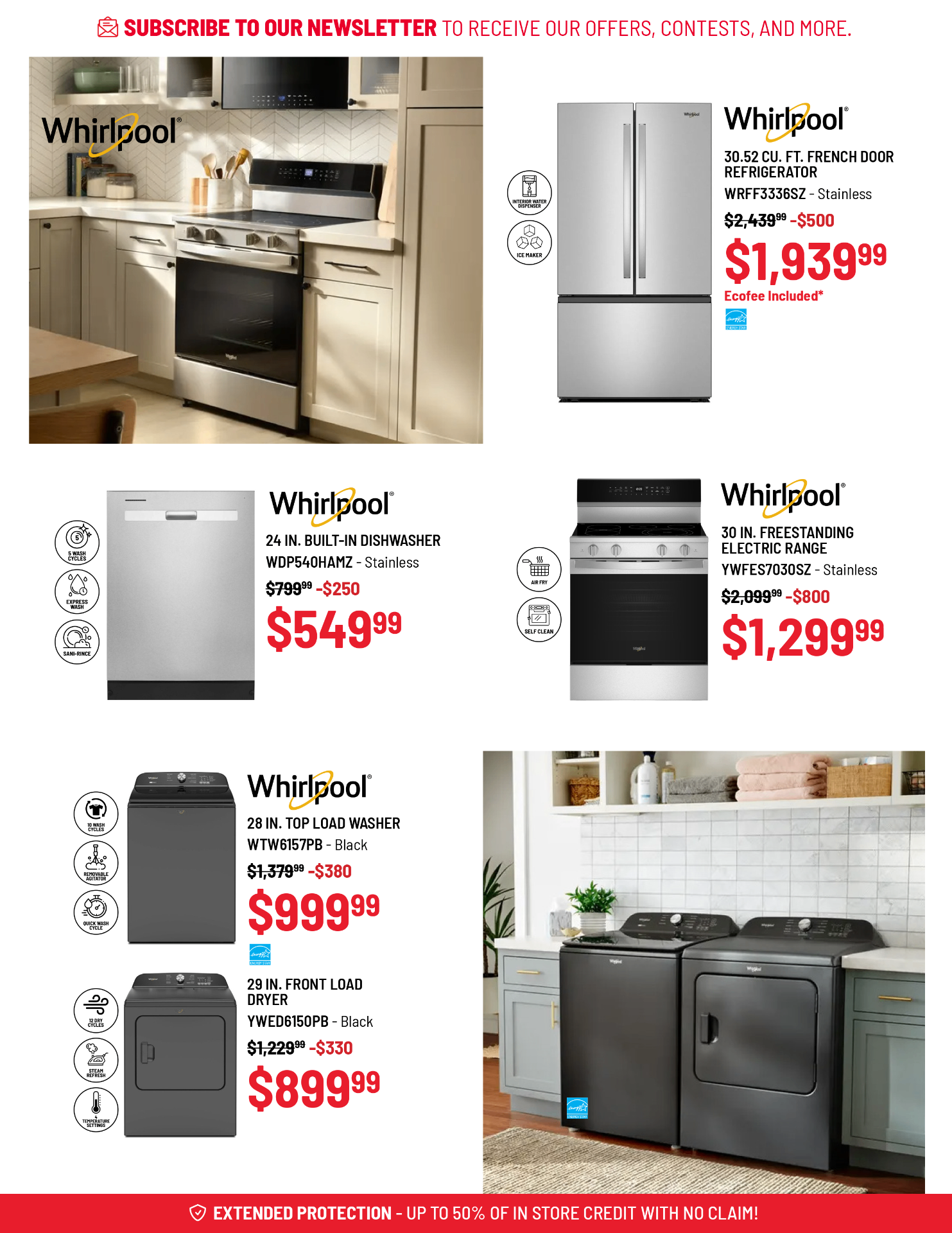
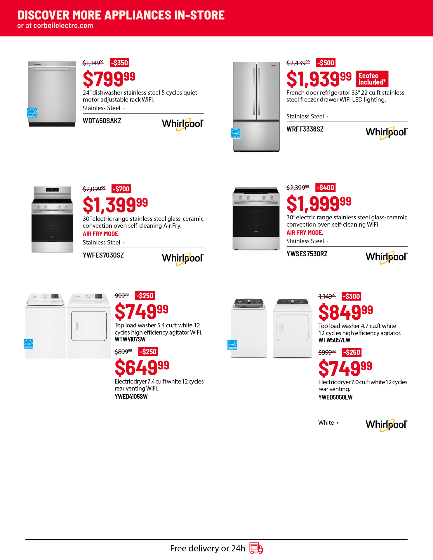
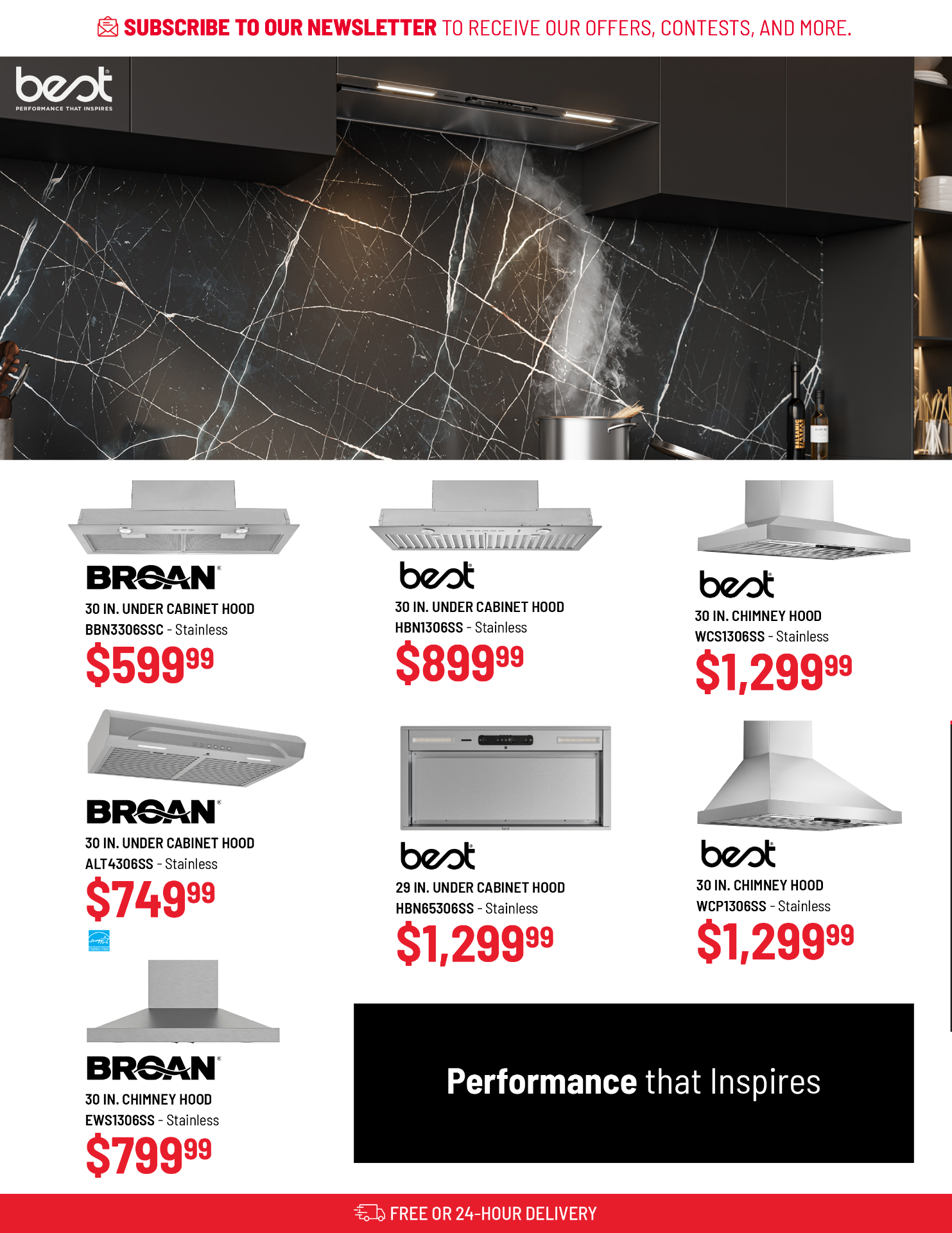
Drag to compare before and after
Each spread presents the original flyer next to the redesigned version. Slide across to see how typography, spacing, and structure were refined to create a clearer and more cohesive layout.


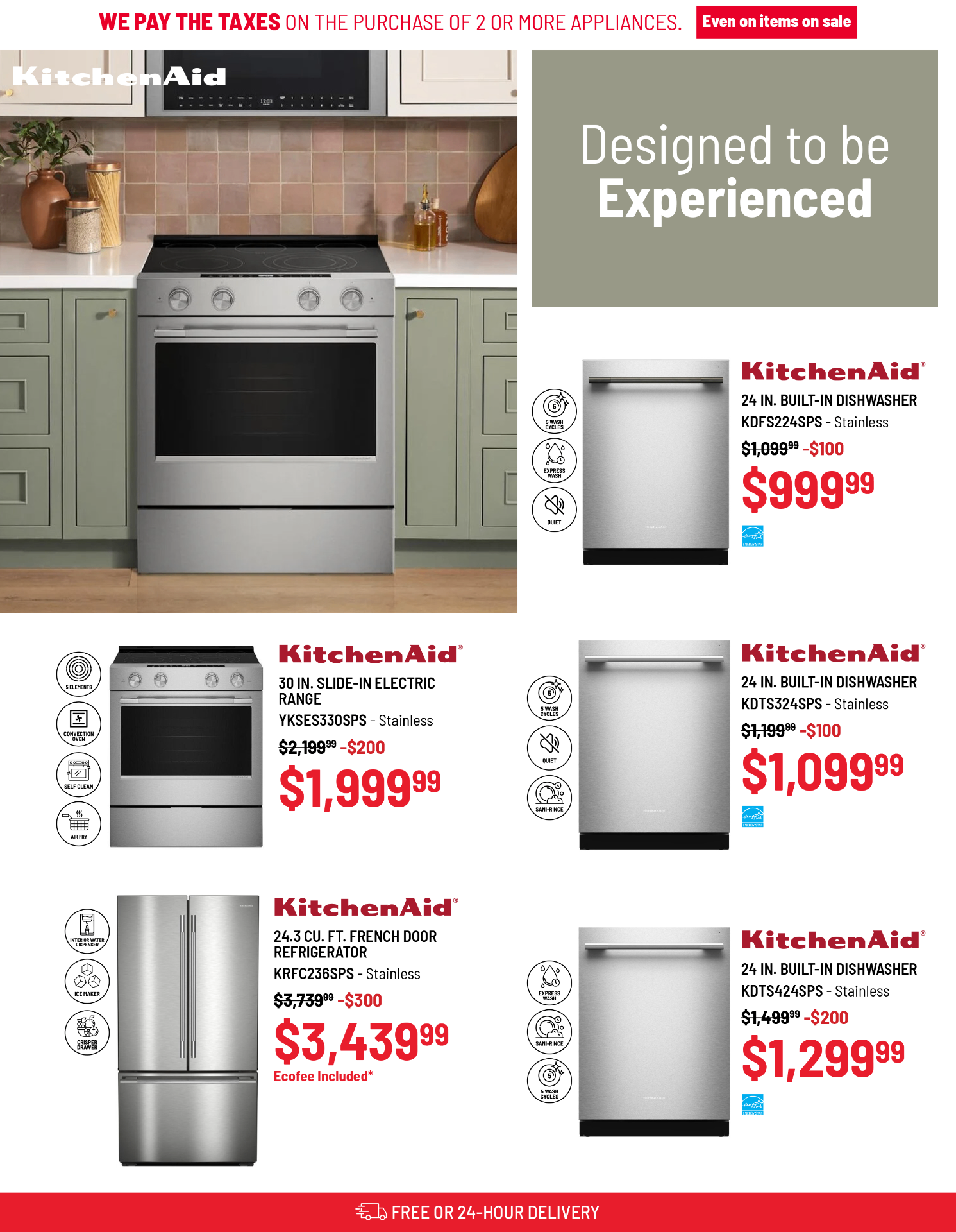
A familiar brand, brought forward — clearer hierarchy, refined typography, and a layout system that scales across every campaign.